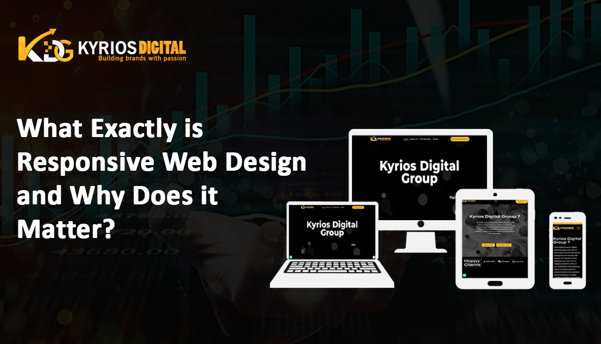
What Exactly is Responsive Web Design and Why Does it Matter?
How does responsive web design work? A method of web design known as responsive web design (RWD) makes sure that websites display properly across a range of window or screen sizes and devices. What are the benefits of Marketing and Advertising industry? Exactly is Responsive Web Design and Why Does it Matter? This approach is to deliver the best possible viewing experience, effortless reading, and minimal resizing, panning, and scrolling across a variety of platforms, including smartphones and desktop PCs. Responsive web design as opposed to adaptive web design Frequently mistaken with responsive web design, adaptive web design is a different methodology. Adaptive design focuses on preset layout sizes based on typical device widths, but responsive design adapts to diverse screen sizes using fluid grids and flexible pictures. Although it necessitates more up-front work, adaptive design can result in a smoother user experience on some devices by detecting the screen size of the device and loading the right layout accordingly. Best Practices and Things to Think About in Responsive Design Design for mobile first: begin with the lowest screen size and work your way up to bigger ones. This guarantees that mobile users receive the most important features and content first. Flexible Grids: To design flexible grids that adjust to various screen sizes, use relative units like percentages or ems rather than fixed ones like pixels. Media Queries: You may use CSS media queries to apply various styles according on the device’s orientation, resolution, screen width, and height. Fluid pictures: To avoid distortion or overflow, make sure pictures are resized according to the container size. Viewport Meta element: To adjust the viewport’s size and scaling across various devices, include the viewport meta element in your HTML. Progressive Enhancement: Create websites that are fundamentally functional and compatible with all devices, then improve the experience for those who have more features. Testing and Optimization: To find and address any layout or performance issues, test your website often across a range of devices and browsers. Why is a Website Good? A well designed website is more than just eye candy; it becomes a medium for smooth user interfaces, intelligent information distribution, and the accomplishment of the targeted objectives. An examination of what makes a fantastic website is provided below: User-Centric Design: A great website is built on a design philosophy that puts the wants and requirements of its target audience first. Every element, including the navigation structure and interface layout, is painstakingly designed with the user experience in mind. Quick Loading Speed: In the digital world, quickness is critical. A website may provide blazingly quick loading speeds by utilizing content delivery networks (CDNs), optimizing file sizes, and implementing caching techniques. This keeps users engaged while they wait for material to load. Intuitive Navigation: A website should be as easy to use as walking along a clearly indicated route. The whole browsing experience is improved by users being guided to their preferred destinations with the least effort through clear organization and user-friendly menus. Mobile-Friendly Design: With the increasing use of tablets and smartphones, making sure a website is mobile-friendly is now a need rather than a choice. For a website to be universally accessible and user-friendly, its design must flow naturally across a range of screen sizes and device kinds. Captivating Content: Content is what really draws people in and keeps them interested, regardless of how it looks. A successful website relies heavily on its content, which may take many forms. Some examples of this material are engaging images, interactive multimedia, or instructive articles that entice users to explore deeper and come back for more. Brand Consistency: Because a website is a company’s digital representative, it is critical to uphold brand consistency. Every visual component, including color schemes and typography, should represent the brand’s identity to encourage visitor recognition and trust. Accessibility: Building an inclusive website that serves people of all abilities is essential. Ensuring that the site is accessible to all users and easy to browse is achieved by adhering to accessibility standards, which include adequate HTML markup, keyboard navigation support, and informative alt text for pictures. Important Concepts in Responsive Web Design A number of fundamental ideas underpin responsive web design, assisting developers and designers in producing flexible and user-friendly websites: Fluid Grids: To construct flexible grids that adjust to various screen sizes, use relative units like percentages or ems rather than fixed ones like pixels. Flexible pictures: To avoid distortion or overflow, make sure pictures adjust according to the container size. Media Queries: You may use CSS media queries to apply various styles according to the device’s orientation, resolution, screen width, and height. Viewport Meta Element: To manage the viewport’s size and scaling across various devices, include the viewport meta element in your HTML. Progressive Enhancement: Create websites that are fundamentally functional and responsive to all types of devices, then improve the experience for those with more power. The advantages of responsive web design Better User Experience: Websites that are responsive to various screen sizes and resolutions offer a unified and user-friendly experience on PCs, laptops, tablets, and smartphones. Expanded Reach: Responsive design makes sure that your website is seen by a larger audience on any platform, thanks to the rising number of mobile users. SEO-Friendly: Because Google gives preference to mobile-friendly websites in its search results, responsive design might raise your website’s exposure and effectiveness there. Cost-Efficiency: Responsive design enables you to keep a single website that serves all consumers, lowering development and maintenance expenses, as opposed to building several websites or applications for different devices. Future-Proofing: Responsive design makes that your website stays functional and compatible across the constantly evolving range of digital devices, even as new devices with different screen sizes and resolutions appear. In conclusion, responsive web design is critical to building contemporary, user-friendly websites that accommodate the wide range of requirements and tastes of the online audience of today. Businesses may improve their online presence, attract a larger audience, and provide a seamless user experience
What Exactly is Responsive Web Design and Why Does it Matter? Read More »
Website Design